That first design was done by Holger and Juergen. They had taken my front panel layout, and added their graphic ideas, and I had no idea what it was going to look like before I arrived in Germany, and...well....to be honest, I was pretty depressed!
There we were, 2 weeks before our Frankfurt Messe debut in 2007, and my ‘dream synth’ looked more like an ugly duckling!
I contacted Axel Hartmann, well known for his graphics design, to see if he could work on an ‘emergency rush job’ to fix things, and he came up with a definite improvement:
1)
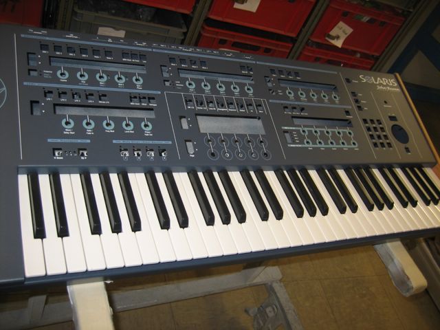
- Axel graphics 1.jpg (59.29 KiB) Viewed 11126 times
2)
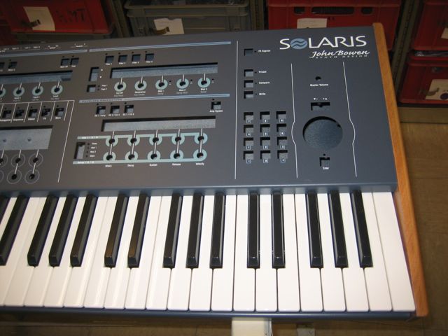
- Axel graphics 2.jpg (52.97 KiB) Viewed 11126 times
3)
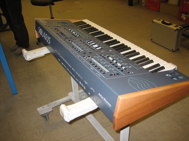
- Axel graphics 3.jpg (48.91 KiB) Viewed 11126 times
The Solaris logo, with the ‘wave’ in the O, was actually done by a very good friend of mine, John Heisch. I had planned on using that, no matter what, however, it got voted down by my associates, and we proceeded to rework the graphics for the subsequent prototypes, abandoning as well Axel’s design.
We finally ended up using some graphic designs done (via much discussion) by Goffe Torgerson. You can see several of these in the Solaris Synth Facebook photo collection. We continued to simplify with each successive prototype, ending up with the final production graphic look you have now. Much better, I think!